Tweet
Share

Analyzing the 2020 Election

The 2020 US presidential election has concluded and there is a lot of debate about the result. Without going into details about what is claimed by each side, we thought it would be interesting to see how the data for the popular and electoral college votes compares to previous elections. For purposes of these comparisons we will look at the elections that have occurred since 1992 because this represents the post-internet elections and politics after the first Gulf War. We'll also focus on just the votes for the two major candidates which (except for 1992 and 1996) represent well over 95% of all the votes cast. Under the US system, third parties have no realistic chance to win so the two major parties are what matters.

The big question is - did the election of 2020 exhibit any unusual patterns of votes?

First, when we look at the popular vote, how did the numbers for Biden and Trump look?

In general, the overall number of votes increases because the population of the nation increases. We can see that the overall turnout in 2020 was much higher than the previous two elections which is likely driven by the combination of the extremely contentious election and the fact that the covid-19 pandemic caused many states to expand their mail-in and early voting procedures. Even so, it's pretty much what we would expect if the trend line from 1996-2008 had continued.

The margin of victory for Biden seems like an average of Obama's two elections and on par with Clinton's victories in the 1990s - it seems pretty typical for the margin when a Democrat wins.

We can look at the same popular vote data a slightly different way by looking at the percentages of the popular vote (again, just counting the two major party candidates) and here we can see that Biden's election is actually less remarkable than both of Clinton's elections and Obama's first election.

The conclusion from looking at these plots is that there doesn't seem to be a pattern of popular votes that is unusual historically. There is no evidence of voter fraud or unusual vote numbers.

The popular vote plots above are the ones that most directly reflect how the nation voted, but what do the Electoral College votes look like? This is the technical mechanism that the US uses to decide the winner. In the figure below we can see that Biden's victory in 2020 is essentially of the same magnitude as Trump's victory in 2016, but much less that the margin for both of Clinton's elections and both of Obama's elections. The unusual shift was in 2016 when Trump won the Electoral College with a wider margin than Bush did in 2004 despite the fact that Bush won the popular vote in that election with 51.2% while Trump had only 48.9% of the popular vote in 2020.

As we did above, we can look at the Electoral College vote data by looking at the percentages and here we can see that Biden's election is closer than both of Clinton's elections and Obama's elections. Biden's margin of victory here is clearly the same as Trump's. It is also evident here that Trump's Electoral College vote was more decisive than either of Bush's elections, but less decisive than both of Clinton's elections and both of Obama's elections.

The conclusion from looking at these plots is that there doesn't seem to be a pattern of Electoral College votes that is unusual historically.

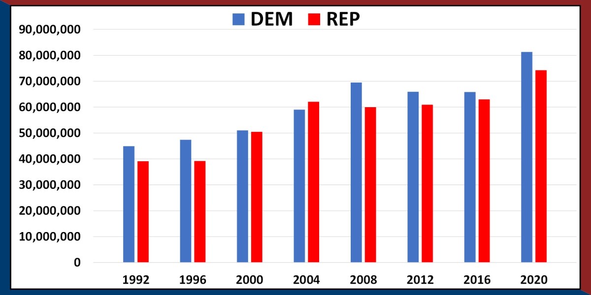
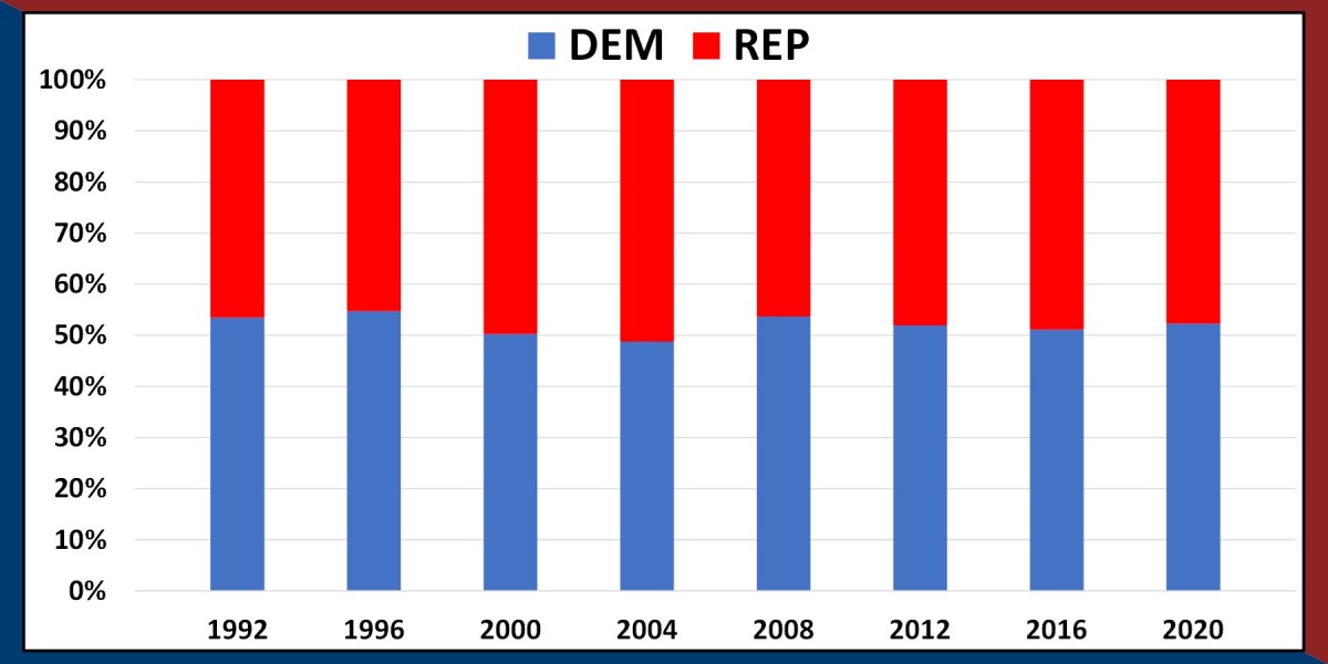
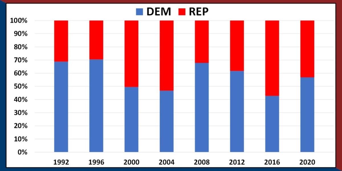
From looking at the popular vote totals there is no evidence of voter fraud or unusual vote numbers. Also, the Electoral College vote totals are in line with exactly what we expect based on the voting observed.

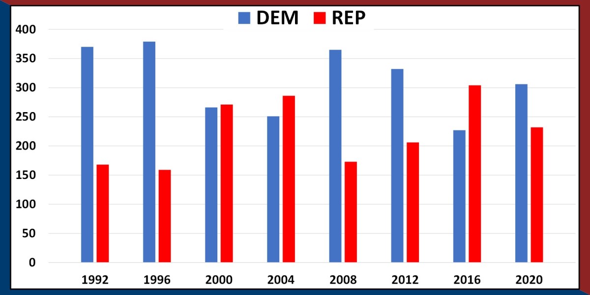
This occasional mismatch between the popular vote and Electoral College vote is interesting. The Electoral College was designed to be a mechanism with the primary purpose of representing the popular vote when communication technology was primitive (there are some details about preserving slavery and representing rural citizens that we won't go into). How well does the electoral college vote represent the popular vote?

We can look at this in the two figures below where the percentage of the popular vote in plotted on the X-axis and the percentage of the Electoral College vote is plotted on the Y-axis. If the representation conferred by the Electoral College is perfectly accurate then the data points for each election would lie directly on the best-fit line which would go through the origin and the point (50%, 269 Electoral College votes).

In the plots below we can see that there is considerable noise. Neither Republican nor Democratic votes are being consistently represented by the Electoral College. There are some elections where the number of electoral college votes each party gets are more or less than expected based on the overall relationship between the popular vote and Electoral College vote. On neither plot does the relationship go through the point (50, 269) which is marked with the purple "+" symbol.

Finally, when combining these plots we can see that in addition to adding randomness to the election system, the use of the Electoral College favors the Republicans over the Democrats. On average, for the same degree of popular vote support, the Republicans are awarded 20 more Electoral College votes. On average this creates systematic bias whereby a Democratic candidate needs to win 50.4% of the popular vote whereas a Republican needs 49.6% for their chances to be even.

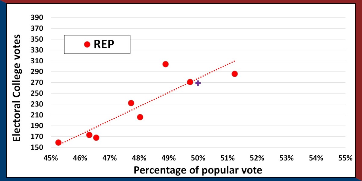
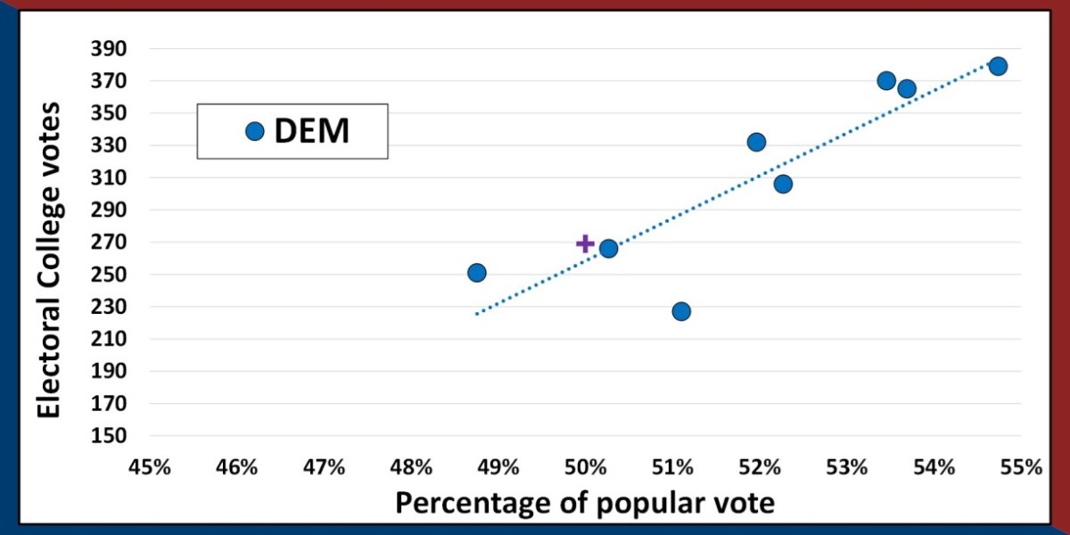
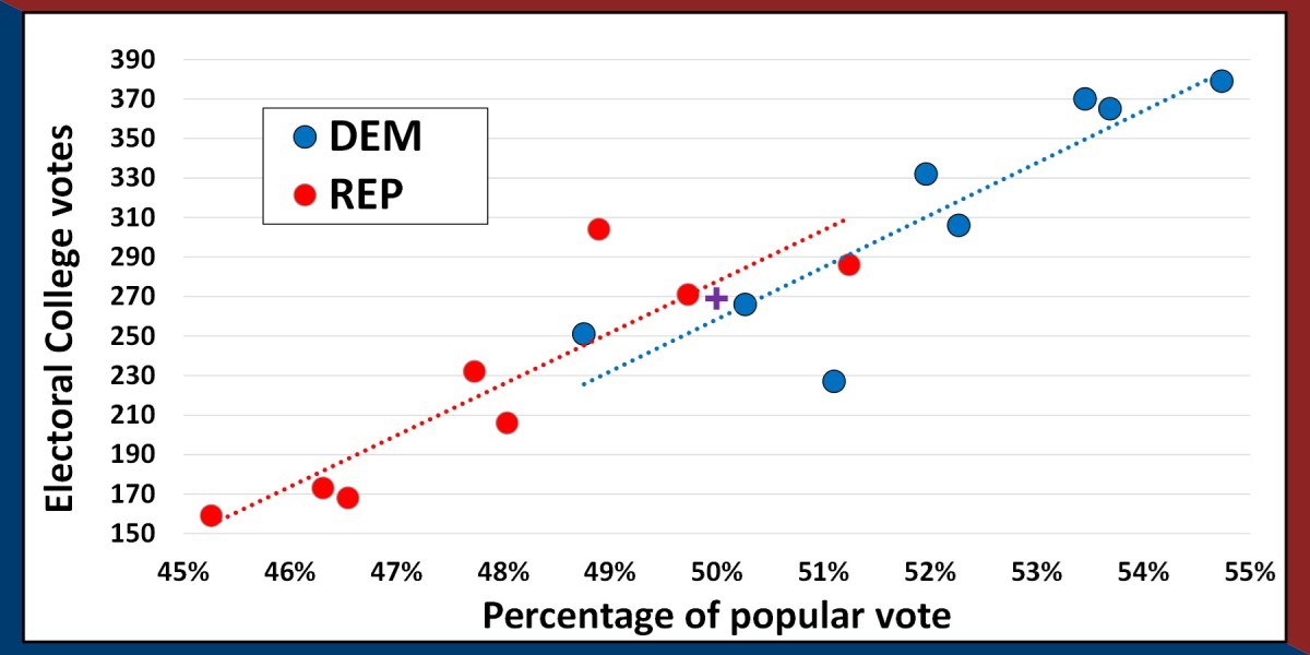
This bias, plus the added randomness from the Electoral College explains how the Republicans have only won the popular vote once in the last 8 elections, but won the presidency 3 times.


Connect with StatsExamples here


This information is intended for the greater good; please use statistics responsibly.